It’s unusual to come across a truly bad new digital service these days. People now praise the online passport service for speed and ease of use, the same for Jobseeker’s, voter registration.
Most online public services delivered since the establishment of the Government Digital Service are at least functional and many are best of breed.
So it is interesting to find yourself trying to use a brand new online service which is a complete failure.
The new Civil Service Pensions site is fascinating for being just such a failure.
The contract for Civil Service pensions was recompeted and Capita won the contract for the service which went “live” on 1st December 2025.
And it has been an abject failure on many levels. So much so that the Cabinet Office and Capita just posted a joint apology, the Cabinet Office emailed all serving Civil Servants to apologise and Ministers have apologised in the House.
You might wonder why they did not email the pensioners affected but of course such contact information is held on the now non-working system. Just one of the many examples of a lack of planning in the handover.
Fortunately my union has my contact details.
I am not going to comment on the issues of the number of outstanding cases nor the operation of the service instead I am going to focus on the simplest part to get right.
The online service.
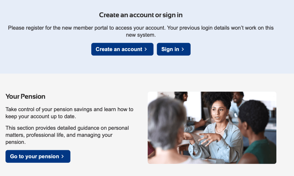
The online service is essentially a membership website. Non-members can browse for information and members can register for an account to access their own personal details and raise queries, ask for help and make changes or download copies of legal documents like P60’s.
It currently looks like this.
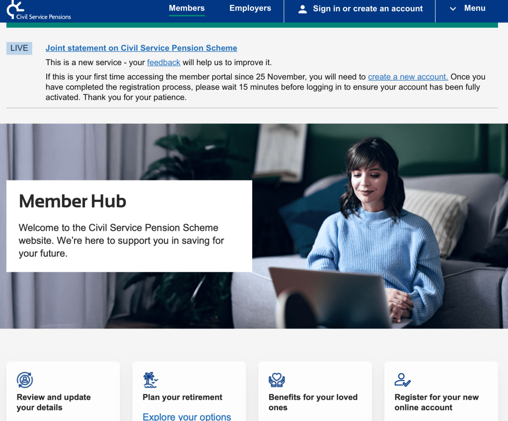
As you will see it looks a bit like the GOV.UK style guide but it is soon very clear that it does not conform to the guide in any meaningful way. The random font choices are the first hint.
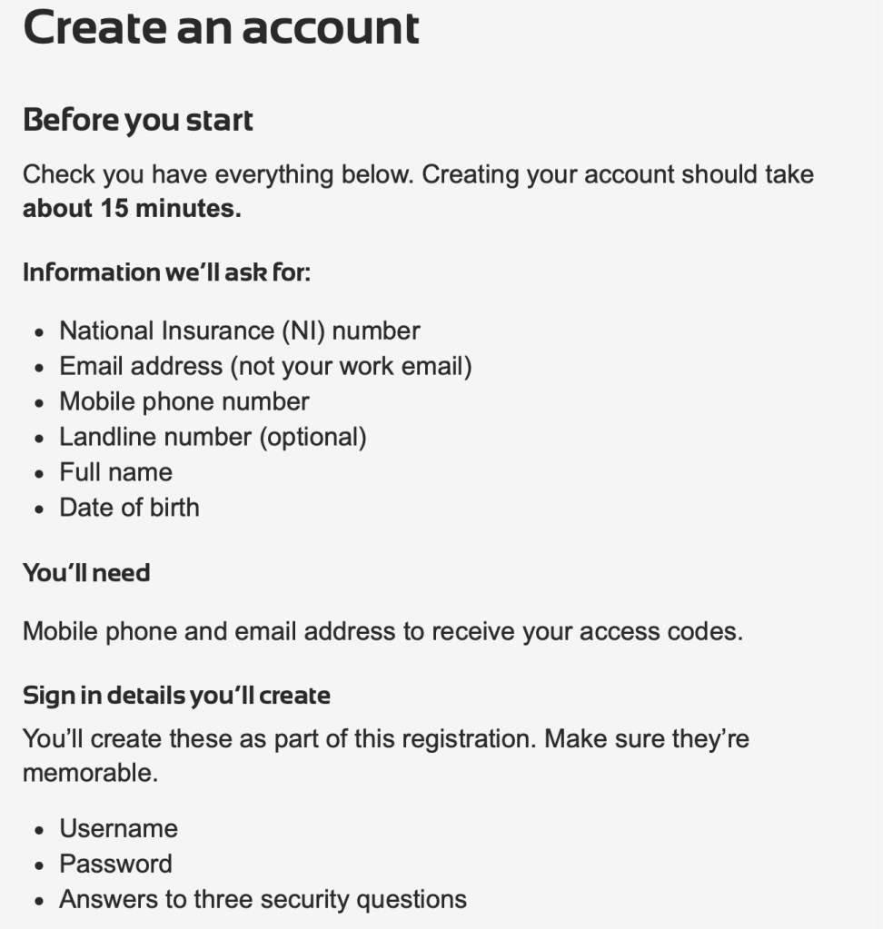
When you try and register an account the page gives you a useful check list of what you will need to complete the task.
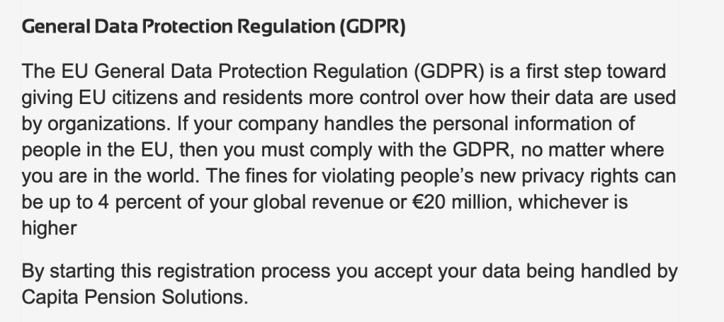
However it then includes this unnecessary and deeply confusing paragraph about the GDPR. This gives the strong impression that the people designing the site do not understand the GDPR and may confuse and even scare people trying to register.
This is a theme we will return to.
The site then asks for your National Insurance Number. It does not follow the GOV.UK style guide but it’s straight forward enough until you submit the response.
At which point the CONTINUE button changes to “processing” and a spinning disk turns in the middle of the screen for a few moments until the next page arrives.
So what is it doing? Well looking at the source code the site seems to have been built with Microsoft Power Pages
Which is described as “a secure, enterprise-grade, low-code software as a service (SaaS) platform for creating, hosting, and administering modern external-facing business websites. Whether you’re a low-code maker or a professional developer, Power Pages empowers you to rapidly design, configure, and publish websites that work across web browsers and devices.”
So it allows you to create a website which links to a MS Dynamics 365 backend.
It is an odd choice for a complex million+ user service and not one I would have made.
As a “low-code” development tool you take what you are given which leads this piece of JSON which is used to check NINO’s and other things.
It is … “interesting”
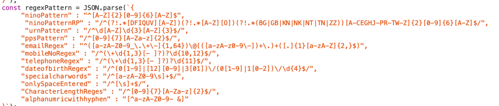
For example data of birth has problems because the month field appears to be limited to 2 characters but if you naturally press space after entering say “04” then you get a confusing error message.
And this site loves confusing error messages.
I just hit page refresh…
I won’t go through all the screens but the final one asks you to agree a very long and once again almost entirely unnecessary set of terms and conditions. I am unsure that any lawyer ever reviewed this site.
I cannot tell you what happens after that as almost every time I have never got beyond that screen despite 2 months of repeated attempts.
Well, that’s not quite true. I tried a different email address to register and had an error message saying that my details did not agree with the records.
But I have never managed to successfully register, so what records are these?
Which raises a whole number of potentially very worrying possibilities including the risk that the system can be in an indeterminate state which a transaction processing system should NEVER be. But I will leave that to the NAO.
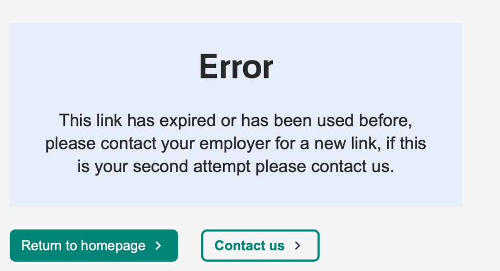
I have tried to use the contact us function but it is impossible to get through to the helpdesk on the phone number because it is overloaded with desperate people with real issues.
So I tried the Contact Us form which has a number of screens. The last one being about information processing and has nearly 2,500 words of unnecessary legalise.
When I submit the form I get this very useful message.
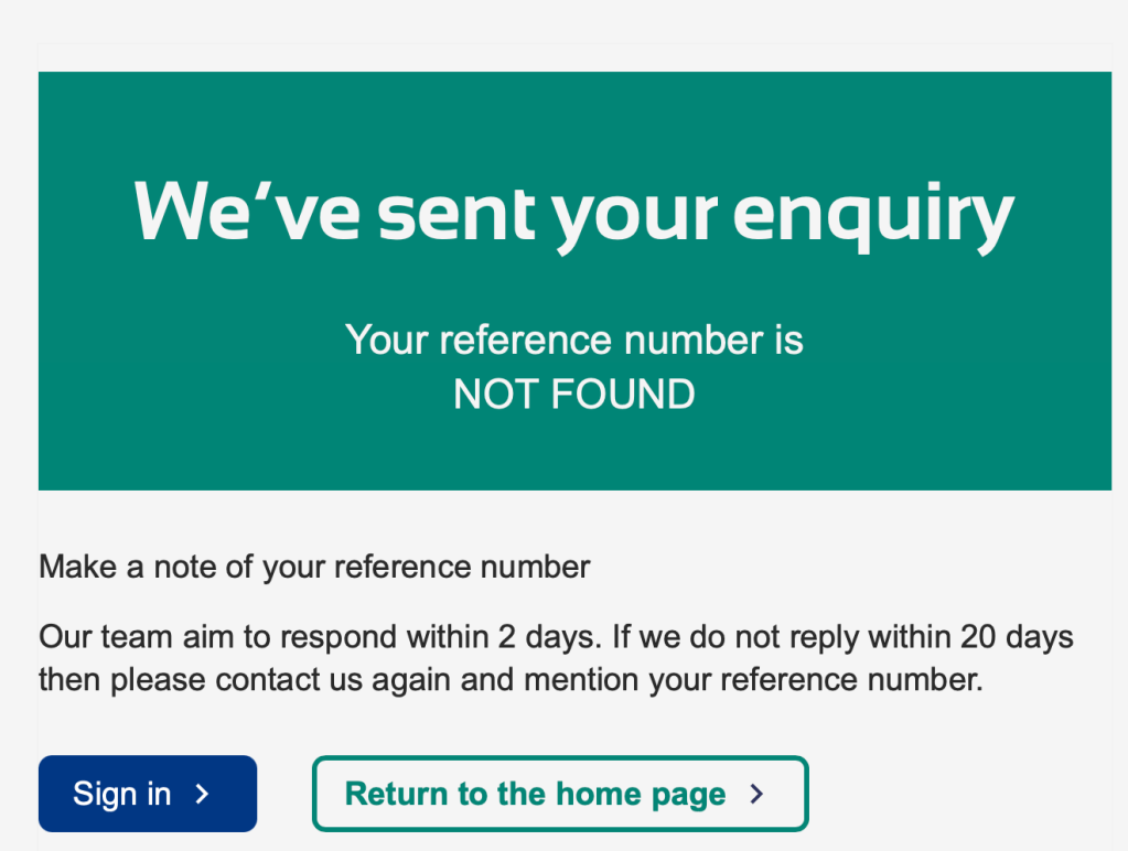
I have no idea who has sent the message nor where they have sent it.
You will note that the reference number is important but does not exist. If I were a cynical ursine I might wonder if any of these complaints and other messages are actually being recorded? Is Capita’s performance against SLA actually accurate?
The business logic of pensions is complex, the data sensitive and fluid.
But the user experience? The website? This is bread and butter stuff.
Having built many of the UK’s digital services I find this deeply disappointing.
How have we allowed something so bad to be inflicted on people, many of whom are definitely not tech experts?
This site would never have passed a GDS Service Standard assessment. So why was it allowed to go live?

How did you like the movie?
Sent from my iPhone
LikeLike